God makes light shine out of darkness. He hides his greatest treasure--his own glory shining in the face of Jesus--in the hearts of his people,fragile and simple as clay jars. It reminds us that the power is not from us, but from God.
As I dip my quill (electronic though it may be) to write this blog, the title Clay Inkpot reminds me where the power and wisdom come from. If what you read has no merit, that's where bits of me have flaked off and muddied the ink.
Thursday, July 20, 2006
Let the Book Cover Judging Begin
"Don't judge a book by its cover," the old adage goes. But today, I'm asking you to do just that. Look at the 4 covers below, keeping in mind that each picture represents an entire book cover, front, spine, and back. (Imagine laying a book open on the table and looking at the whole cover). These covers are all possibilities for the same book. Which would you be most likely to pick up in the book store? Which one would you be most likely to buy? Please enter your votes and any thoughts on the different covers in the comments section.
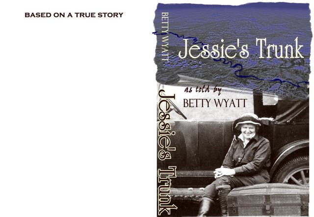
Okay, let's start the voting! I will refer to them as 1,2,3,4 (top to bottom).
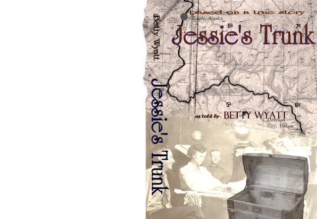
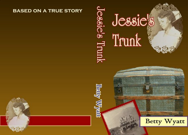
#3 wins for me. I really like the color! The idea of the trunk wrapping around the cover of the book is a neat idea. As you open the book, it is as though you are looking into the trunk. Good spine look too! #2 came in second, though it had been my favorite from the first time I saw it. I like the map, the antique-like colors, the trunk (though as pictured here, it looks empty). I also like the “Based on a True Story” header. I like the big “Jessie’s Trunk.” #1 is third place for me, but the car and the map features are attractive to me (I’m a guy!). #4 is my least favorite. It seems plain and pieced together.
OK, Here goes again. I thought I would be first to respond, but the blogspot comments button ate not only my first attempt (and it was so gentle and articulate too.) but also the lengthy time it took to produce. Here goes a less polished reconstruction:
#1. I am still not convinced the booted lady shown here is really Jessie, and there is really no significant mention of an automobile in the story, so this illustration seems irrelevant and misleading to me. The background is vague and the unreadable map clutters up the title. This is not my favorite.
#2. Well, the map is more obvious; however, there is no clue of what place it shows, so it gives no hint of Alaska or Eeagle, or even of the Yukon River. The empty trunk dominates the picture and quite overcomes our pale heroine and her indistinct companions.
#3. In this illustration the trunk appears obvious, but would a potential buyer realize what it was without opening the book fully and viewing both outer covers at once? Not likely, so I think the title theme is actually concealed in this one. For me the title is visually lost in the blue band, and, BTW, which of the ladies is Jessie? I do like the more symmetrical layout, but how does the picture fit the book’s contents?
#4. I find this cover to be simple and direct, presenting a clean, elemental design. The balance of Jessie (clearly it is her) and the title is appealing. I would raise the trunk a little higher, letting a gap show below it to emphasize the author’s name below. The “Jessie” and “Trunk” photos illustrate the title words well, and the boat picture at least hints at the era even if it does not specify a region. Perhaps this cover’s brown background tone also suggests age and a sepia setting, but I do not think it would be as eye-catching on the vendor’s shelves as would a brighter color like a nice blue or blue-green. Yes, today, I really prefer the simple and honest cover #4.
I appreciate the thought and design time that is evident in these choices. While this portion is being pounded out, I will be working on my project while you are at the OCW Conference.
This is the last lap. Don’t despair now. Soon you will be autographing your books for friends and fans, and when you do I want a copy of my own.
Well, I have probably not put as much thought into this as your other commenters, but I'll just give you my gut reaction to a first glance--I liked them in the order they appeared #1, #2, #3, and #4. I haven't read the story, so I don't know what fits best. Maybe I like the car because I'm a guy. I also like maps, but the confusion about the location might actually downgrade this to 3rd place -- I thought it was the coast of West Africa. Duh. I thought #4 looked like it had been done on Microsoft Publisher--not bad, but amateurish.
I have to say I like #1 best(the top one). The minute I saw the sweet lady with the line "as told by" made me want to hear a story told by Betty Wyatt about this lady (I think I would still want to hear the story about her even if I hadn't known the storyteller). The others didn't seem as inviting. Good work!
I really like #4 but I do not like the solid background. I think it would look nicer with a map as the background.Maybe a light brown map to go with the tone of the photos. I do not really know the story of Jessie's Trunk so I do not know where it has traveled or if there is a need for a map, but the photos on #4 are what I like about the cover.
My instant impression was that #1 stood out best. I carefully reviewed each of them and I still like #1 best. The second one with the map was bland. It was too busy and I wasn't able to clearly see the title. The trunk was cute idea but I'm not sure how clear that would be on a shelf.
Gene and Laura vote for #1. I thought about #2 because I (Laura) love maps, but definitely need to know what they're of. The lady in #1 is appealing and the whole photograph puts me into a setting immediately.


13 comments:
Okay, let's start the voting! I will refer to them as 1,2,3,4 (top to bottom).
#3 wins for me. I really like the color! The idea of the trunk wrapping around the cover of the book is a neat idea. As you open the book, it is as though you are looking into the trunk. Good spine look too!
#2 came in second, though it had been my favorite from the first time I saw it. I like the map, the antique-like colors, the trunk (though as pictured here, it looks empty). I also like the “Based on a True Story” header. I like the big “Jessie’s Trunk.”
#1 is third place for me, but the car and the map features are attractive to me (I’m a guy!).
#4 is my least favorite. It seems plain and pieced together.
All-in-all excellent work!
OK, Here goes again. I thought I would be first to respond, but the blogspot comments button ate not only my first attempt (and it was so gentle and articulate too.) but also the lengthy time it took to produce. Here goes a less polished reconstruction:
#1. I am still not convinced the booted lady shown here is really Jessie, and there is really no significant mention of an automobile in the story, so this illustration seems irrelevant and misleading to me. The background is vague and the unreadable map clutters up the title. This is not my favorite.
#2. Well, the map is more obvious; however, there is no clue of what place it shows, so it gives no hint of Alaska or Eeagle, or even of the Yukon River. The empty trunk dominates the picture and quite overcomes our pale heroine and her indistinct companions.
#3. In this illustration the trunk appears obvious, but would a potential buyer realize what it was without opening the book fully and viewing both outer covers at once? Not likely, so I think the title theme is actually concealed in this one. For me the title is visually lost in the blue band, and, BTW, which of the ladies is Jessie? I do like the more symmetrical layout, but how does the picture fit the book’s contents?
#4. I find this cover to be simple and direct, presenting a clean, elemental design. The balance of Jessie (clearly it is her) and the title is appealing. I would raise the trunk a little higher, letting a gap show below it to emphasize the author’s name below. The “Jessie” and “Trunk” photos illustrate the title words well, and the boat picture at least hints at the era even if it does not specify a region. Perhaps this cover’s brown background tone also suggests age and a sepia setting, but I do not think it would be as eye-catching on the vendor’s shelves as would a brighter color like a nice blue or blue-green. Yes, today, I really prefer the simple and honest cover #4.
I appreciate the thought and design time that is evident in these choices. While this portion is being pounded out, I will be working on my project while you are at the OCW Conference.
This is the last lap. Don’t despair now. Soon you will be autographing your books for friends and fans, and when you do I want a copy of my own.
Well, I have probably not put as much thought into this as your other commenters, but I'll just give you my gut reaction to a first glance--I liked them in the order they appeared #1, #2, #3, and #4. I haven't read the story, so I don't know what fits best. Maybe I like the car because I'm a guy. I also like maps, but the confusion about the location might actually downgrade this to 3rd place -- I thought it was the coast of West Africa. Duh. I thought #4 looked like it had been done on Microsoft Publisher--not bad, but amateurish.
I have to say I like #1 best(the top one). The minute I saw the sweet lady with the line "as told by" made me want to hear a story told by Betty Wyatt about this lady (I think I would still want to hear the story about her even if I hadn't known the storyteller). The others didn't seem as inviting.
Good work!
My house guest picked #1.
I pick #1 as my first choice, and #4 as my second choice.
I'm with Jenna and Anthony -- I liked the first one because it made me think that this was the real person wanting to tell me the story.
We have two votes for #1...it is a cover I would pick up to check out. And one vote for #4.
All the best on this...I can't wait to read it!
I really like #4 but I do not like the solid background. I think it would look nicer with a map as the background.Maybe a light brown map to go with the tone of the photos. I do not really know the story of Jessie's Trunk so I do not know where it has traveled or if there is a need for a map, but the photos on #4 are what I like about the cover.
I think number 3 would be good if there was a skull and crossbones on the chest and gold coins spilling out.
However, I think number 1 gets my vote, though you might get more readers if the sweet lady had a black cape and weilded a red light sabor.
Great job!! Keep up the good effort.
My instant impression was that #1 stood out best. I carefully reviewed each of them and I still like #1 best. The second one with the map was bland. It was too busy and I wasn't able to clearly see the title. The trunk was cute idea but I'm not sure how clear that would be on a shelf.
Gene and Laura vote for #1. I thought about #2 because I (Laura) love maps, but definitely need to know what they're of. The lady in #1 is appealing and the whole photograph puts me into a setting immediately.
#2 is deffinetly my choice. Ilike any map as long as it leads to a treasure!
All are appealing,but my eye went right to #1 and back again.
Post a Comment